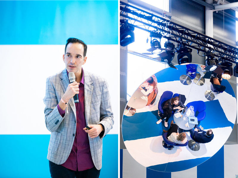
Meeting with Karim Bouhajeb, visual merchandising expert
"Fashion is not something that only exists in clothes. Fashion is in the air, carried by the wind.
You can tell. Fashion is in the sky, in the street,” famously announced Coco Chanel, mother of French haute couture. Fashion, indeed, can be seen and read everywhere. After revealing itself on the catwalks and being displayed on our city walls, fashion is displayed in shop windows. From the hidden boutiques of Avenue Montaigne, to the great masses on Champs Elysées, from the lit up streets of Mayfair, to Tokyo. The window in this sense, is a real, “mediation between the street and the shop, between exterior and interior, public and private, but also and above all, a mediation between supply and demand,” explains Ana Claudia Alves of Oliveira in her book, ‘Vêtement, corps et mode’. According to the academic, the window is the link between exterior and interior vision - it is not simply a facade composition, but refers to a real depth: to a meaning. The selling space, whatever form it takes, is therefore a real bridge between brands and consumers. It’s a dialogue which begins on the outside and develops on the inside. So what is the key to successful visual merchandising? This question is answered by our expert, Karim Bouhajeb, who has been providing his strategic and operational expertise to brands with high added-value, such as Lee Cooper, Levi’s, L'Oréal, Quicksilver and even the Esmod school, for the past 27 years.
Visual merchandising defines the visual organisation of the selling areas of a space; a boutique, concept store, gallery. The aim is to optimise the presentation of products and the well-being and satisfaction of customers. At an intersection of professions and sectors, the visual merchandiser must exhibit true artistic spark in order to present the product in its best light, whilst taking into account the trends of the times and the needs of the client. The role therefore requires artistic, cultural, marketing and economic capabilities all at once, responding to a single final priority: to satisfy the customer who is king, with a buying goal. Often carried out by stylists, designers or marketing professionals, visual merchandising is at the heart of the consumer-brand relationship.
Merchandising is thus based on 4 key principles; communication, organisation, profit management and the attraction of customers for a more comfortable buying experience. The right product must be placed in front of the consumer, in the right place and above all, at the right time. When a customer enters a shop, their eye is immediately drawn to details; to colours, the layout of objects, the outfits of sales assistants… Therefore in visual merchandising, everything has to be thoroughly thought out in advance. A shopping path must be created: from the entrance to the checkout, taking into account, for example, that upon entering a stop, the majority of customers will head to the right. “The devil is in the detail,” as they say. Here, the devil wears Prada. Or not, as the case may be. Every little detail that they don’t like can cause the customer to leave a point of sale. The heights of product displays, points of impact in stores, sizing, anticipation of seasons and the clarity of product range are all crucial points which must be taken into account for successful visual merchandising.The first impression is the most important. Cleanliness, lighting, temperature and product placement are all crucial factors. The first principle, ‘less is more’, advocates clear and simple signage in order to attract customers from the outset. The second, ‘time is money’, indicates, as its name suggests, that every second counts: time, literally is money. Therefore, visual impact drives the purchasing decision. The first twenty seconds inside a store are crucial, and it is all within one minute that the customer spots their product, and decides whether to make a purchase or not during in the last twenty seconds. The ‘farewell message’ delivered by shop floor teams can therefore be decisive. According to Karim Bouhajeb, when a consumer enters a point of sale, they expect brands to subscribe to the ‘customer is king’ philosophy. The shopping experience is central - brands should tell a story to the customer, from their windows to their fitting rooms, in order to relay a more affective message, sometimes appealing to emotion or memory. And always to desire. The window, in this sense, is the first interaction with the client and should be inspired by current events or trends. Create a clear message, spark desire in a customer to wear that outfit, to be seen in it. Each piece of clothing is also a social symbol and demonstrates a desire to be seen looking ones best and to stand out from the crowd. According to the ‘Golden Triangle’ rule, the customer's gaze is first drawn to the centre of the window, then to the right, then to the left. The same goes for inside the store. The major point would therefore be at 1m70 - this is called the ‘focal point’. The window, therefore works not only in height, but also in depth. Generally, fast fashion store windows are too flat: there is a mannequin and a poster. The mannequins must be well arranged so that the customer can identify themselves and mentally project themselves into the scene.Colours are also important. Since colours can really brighten up a space, they should not be too strong and it is advised to keep to less than three main colours. Cooler colours should be favoured, as they open up a room. Accessories are also at the centre of the arrangement, in order to encourage the customer to project themselves. Atmosphere and sound volume are key in the vision a client has of a brand or boutique. ‘Zoning’ is just as important since it distinguishes impulse buys, from routine purchases (situated at the back of the store) and from purchases which don’t require too much thought (such as a suit which is most effectively displayed on the right of a wall). Purchases which are more expensive, so require more in depth decision-making, should be placed in the middle of the shop, inside a glass display case if possible.The organisation, analysis, planning and zoning of a space are all to be taken into consideration for optimal visual merchandising. Each window, boutique, store, presents itself like a stage where the customer is about to play a role. Each space, object, item of clothing and accessory tells a story which comes to life before our eyes. And like every story, it can be good or bad, and perhaps even finish with a ‘happy ending’.